WPF之重写TabControl样式🔥
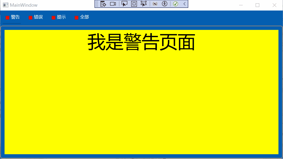
# 效果演示
# 什么是TabControl
TabControl 是一种用户界面控件,用于在一个窗口内创建多个选项卡(Tab),每个选项卡可以包含不同的内容或控件,使得用户可以在同一个窗口内切换不同的视图或功能模块,而不需要打开多个窗口,从而提高了界面的整洁性和用户体验。
在WPF(Windows Presentation Foundation)中,TabControl是一个用于创建选项卡界面的控件。TabControl.ItemTemplate、TabControl.ContentTemplate和TabControl.Template是它的三个不同属性,用于定义不同部分的外观和布局。它们的区别在于它们应用的范围和目的不同。以下是对它们的详细解释:
# 1、TabControl.ItemTemplate
ItemTemplate 属性用于定义选项卡头部的外观。具体来说,它用于设置每个选项卡标题(TabItemHeader)的数据模板,用于自定义选项卡头部的外观和布局。
<TabControl.ItemTemplate>
    <DataTemplate>
        <StackPanel Orientation="Horizontal">
            <Rectangle Fill="Red" Height="10" Width="10" Margin="5"/>
            <TextBlock Text="{Binding Header}" />
        </StackPanel>
    </DataTemplate>
</TabControl.ItemTemplate>
2
3
4
5
6
7
8
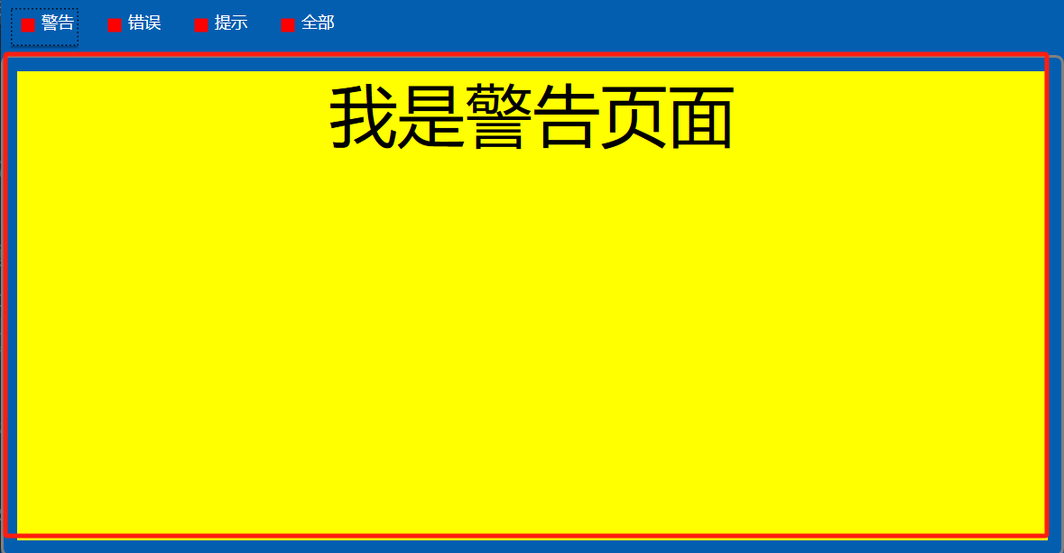
这个TabItemHeader的样式效果如下:

# 2、TabControl.ContentTemplate
ContentTemplate 是 WPF 中 TabControl 的一个属性,用于指定如何呈现选项卡内容的模板。该属性是一个 DataTemplate,用于定义每个选项卡的内容部分的显示方式。
<TabControl.ContentTemplate>
    <DataTemplate>
        <Border BorderBrush="Gray" BorderThickness="2" CornerRadius="5" Padding="10">
            <StackPanel Background="{Binding Color}">
                <TextBlock Text="{Binding Content}" FontSize="50"  HorizontalAlignment="Center"/>
            </StackPanel>
        </Border>
    </DataTemplate>
</TabControl.ContentTemplate>
2
3
4
5
6
7
8
9
这个TabItemHeader的样式效果如下:
# 3、TabControl.Template
Template是 WPF 中 TabControl 的一个属性,用于指定 TabControl 的控件模板(ControlTemplate)。ControlTemplate 定义了 TabControl 的整体结构和视觉外观,包括选项卡头部的排列方式和选项卡内容的呈现方式。
<TabControl.Template>
    <ControlTemplate TargetType="TabControl">
        <Grid Background="#045EB0">
            <Grid.RowDefinitions>
                <RowDefinition Height="Auto"/>
                <RowDefinition Height="*" />
            </Grid.RowDefinitions>
            <WrapPanel x:Name="HeaderPanel" Grid.Row="0" IsItemsHost="True" Background="#045EB0"/>
            <ContentPresenter x:Name="ContentPanel" Grid.Row="1" ContentSource="SelectedContent"/>
        </Grid>
    </ControlTemplate>
</TabControl.Template>
2
3
4
5
6
7
8
9
10
11
12
WrapPanel 是用于排列 TabItem 头部的面板,通过设置IsItemsHost="True",指示这个 WrapPanel 是选项卡头部的容器。ContentPresenter 用于显示当前选中的选项卡内容。ContentSource 属性绑定到 TabControl 的 SelectedContent 属性。
自定义选项卡头部的布局:可以将 WrapPanel 替换为其他布局控件(如 StackPanel 或 DockPanel),以改变选项卡头部的排列方式。 自定义选项卡内容的样式:可以在 ContentPresenter 周围添加其他控件。
# 4、TabControl.ItemContainerStyle
ItemContainerStyle 是 WPF 中 TabControl 的一个属性,用于定义应用到 TabItem 容器的样式。该样式影响每个 TabItem 的外观和行为,可以使用触发器和视觉状态来控制 TabItem 在不同状态下的外观。
<TabControl.ItemContainerStyle>
    <Style TargetType="TabItem">
        <Setter Property="Padding" Value="10,5" />
        <Setter Property="Margin" Value="5" />
        <Setter Property="Foreground" Value="White" />
        <Setter Property="Background" Value="#045EB0" />
        <Setter Property="HorizontalContentAlignment" Value="Center" />
        <Setter Property="VerticalContentAlignment" Value="Center" />
        <Setter Property="Template">
            <Setter.Value>
                <ControlTemplate TargetType="TabItem">
                    <Grid>
                        <Grid.RowDefinitions>
                            <RowDefinition/>
                            <RowDefinition/>
                        </Grid.RowDefinitions>
                        <ContentPresenter x:Name="ContentSite2"
                                VerticalAlignment="Center"
                                HorizontalAlignment="Center"
                                ContentSource="Header"
                                Margin="{TemplateBinding Margin}"  Grid.Row="0"/>
                        <Rectangle x:Name="Border" Fill="#045EB0" Width="50" Height="2" Grid.Row="1"/>
                    </Grid>
                    <ControlTemplate.Triggers>
                        <Trigger Property="IsSelected" Value="True">
                            <Setter TargetName="Border" Property="Fill" Value="#014888" />
                        </Trigger>
                        <Trigger Property="IsMouseOver" Value="True">
                            <Setter TargetName="Border" Property="Fill" Value="#004079" />
                        </Trigger>
                    </ControlTemplate.Triggers>
                </ControlTemplate>
            </Setter.Value>
        </Setter>
    </Style>
</TabControl.ItemContainerStyle>
2
3
4
5
6
7
8
9
10
11
12
13
14
15
16
17
18
19
20
21
22
23
24
25
26
27
28
29
30
31
32
33
34
35
36
这个能达到切换选项卡头部时下面的长条矩形颜色会发生改变。
# 完整代码
<Window x:Class="TabControlDemo.MainWindow"
        xmlns="http://schemas.microsoft.com/winfx/2006/xaml/presentation"
        xmlns:x="http://schemas.microsoft.com/winfx/2006/xaml"
        xmlns:d="http://schemas.microsoft.com/expression/blend/2008"
        xmlns:mc="http://schemas.openxmlformats.org/markup-compatibility/2006"
        xmlns:local="clr-namespace:TabControlDemo"
        mc:Ignorable="d"
        Title="MainWindow" Height="450" Width="800">
    <Grid>
        <TabControl ItemsSource="{Binding TabItemList}" SelectedIndex="0">
            <!-- Customizing the Tab Headers -->
            <TabControl.ItemTemplate>
                <DataTemplate>
                    <StackPanel Orientation="Horizontal">
                        <Rectangle Fill="Red" Height="10" Width="10" Margin="5"/>
                        <TextBlock Text="{Binding Header}" />
                    </StackPanel>
                </DataTemplate>
            </TabControl.ItemTemplate>

            <!-- Customizing the Tab Content -->
            <TabControl.ContentTemplate>
                <DataTemplate>
                    <Border BorderBrush="Gray" BorderThickness="2" CornerRadius="5" Padding="10">
                        <StackPanel Background="{Binding Color}">
                            <TextBlock Text="{Binding Content}" FontSize="50"  HorizontalAlignment="Center"/>
                        </StackPanel>
                    </Border>
                </DataTemplate>
            </TabControl.ContentTemplate>

            <!-- Customizing the Entire TabControl -->
            <TabControl.Template>
                <ControlTemplate TargetType="TabControl">
                    <Grid Background="#045EB0">
                        <Grid.RowDefinitions>
                            <RowDefinition Height="Auto"/>
                            <RowDefinition Height="*" />
                        </Grid.RowDefinitions>
                        <WrapPanel x:Name="HeaderPanel" Grid.Row="0" IsItemsHost="True" Background="#045EB0"/>
                        <ContentPresenter x:Name="ContentPanel" Grid.Row="1" ContentSource="SelectedContent"/>
                    </Grid>
                </ControlTemplate>
            </TabControl.Template>

            <TabControl.ItemContainerStyle>
                <Style TargetType="TabItem">
                    <Setter Property="Padding" Value="10,5" />
                    <Setter Property="Margin" Value="5" />
                    <Setter Property="Foreground" Value="White" />
                    <Setter Property="Background" Value="#045EB0" />
                    <Setter Property="HorizontalContentAlignment" Value="Center" />
                    <Setter Property="VerticalContentAlignment" Value="Center" />
                    <Setter Property="Template">
                        <Setter.Value>
                            <ControlTemplate TargetType="TabItem">
                                <Grid>
                                    <Grid.RowDefinitions>
                                        <RowDefinition/>
                                        <RowDefinition/>
                                    </Grid.RowDefinitions>
                                    <ContentPresenter x:Name="ContentSite2"
                                            VerticalAlignment="Center"
                                            HorizontalAlignment="Center"
                                            ContentSource="Header"
                                            Margin="{TemplateBinding Margin}"  Grid.Row="0"/>
                                    <Rectangle x:Name="Border" Fill="#045EB0" Width="50" Height="2" Grid.Row="1"/>
                                </Grid>
                                <ControlTemplate.Triggers>
                                    <Trigger Property="IsSelected" Value="True">
                                        <Setter TargetName="Border" Property="Fill" Value="#014888" />
                                    </Trigger>
                                    <Trigger Property="IsMouseOver" Value="True">
                                        <Setter TargetName="Border" Property="Fill" Value="#004079" />
                                    </Trigger>
                                </ControlTemplate.Triggers>
                            </ControlTemplate>
                        </Setter.Value>
                    </Setter>
                </Style>
            </TabControl.ItemContainerStyle>
        </TabControl>
    </Grid>
</Window>


public partial class MainWindow : Window
{
	public MainWindow()
	{
		InitializeComponent();
		DataContext = this;
		TabItemList.Add(new MyTabItem() { Header="警告",Content= "我是警告页面",Color = "yellow" });
		TabItemList.Add(new MyTabItem() { Header="错误",Content= "我是错误页面" ,Color = "red" });
		TabItemList.Add(new MyTabItem() { Header="提示",Content= "我是提示页面" ,Color="orange"});
		TabItemList.Add(new MyTabItem() { Header="全部",Content= "我是全部页面" ,Color = "green" });
	}

	public ObservableCollection<MyTabItem> TabItemList { get; set; } = new ObservableCollection<MyTabItem>();
}

public class MyTabItem
{
	public string Header { get; set; }
	public string Content { get; set; }

	public string Color { get; set; }
}
2
3
4
5
6
7
8
9
10
11
12
13
14
15
16
17
18
19
20
21
22
23
24
25
26
27
28
29
30
31
32
33
34
35
36
37
38
39
40
41
42
43
44
45
46
47
48
49
50
51
52
53
54
55
56
57
58
59
60
61
62
63
64
65
66
67
68
69
70
71
72
73
74
75
76
77
78
79
80
81
82
83
84
85
86
87
88
89
90
91
92
93
94
95
96
97
98
99
100
101
102
103
104
105
106
107
108